


Table of contents
What is Media Query?
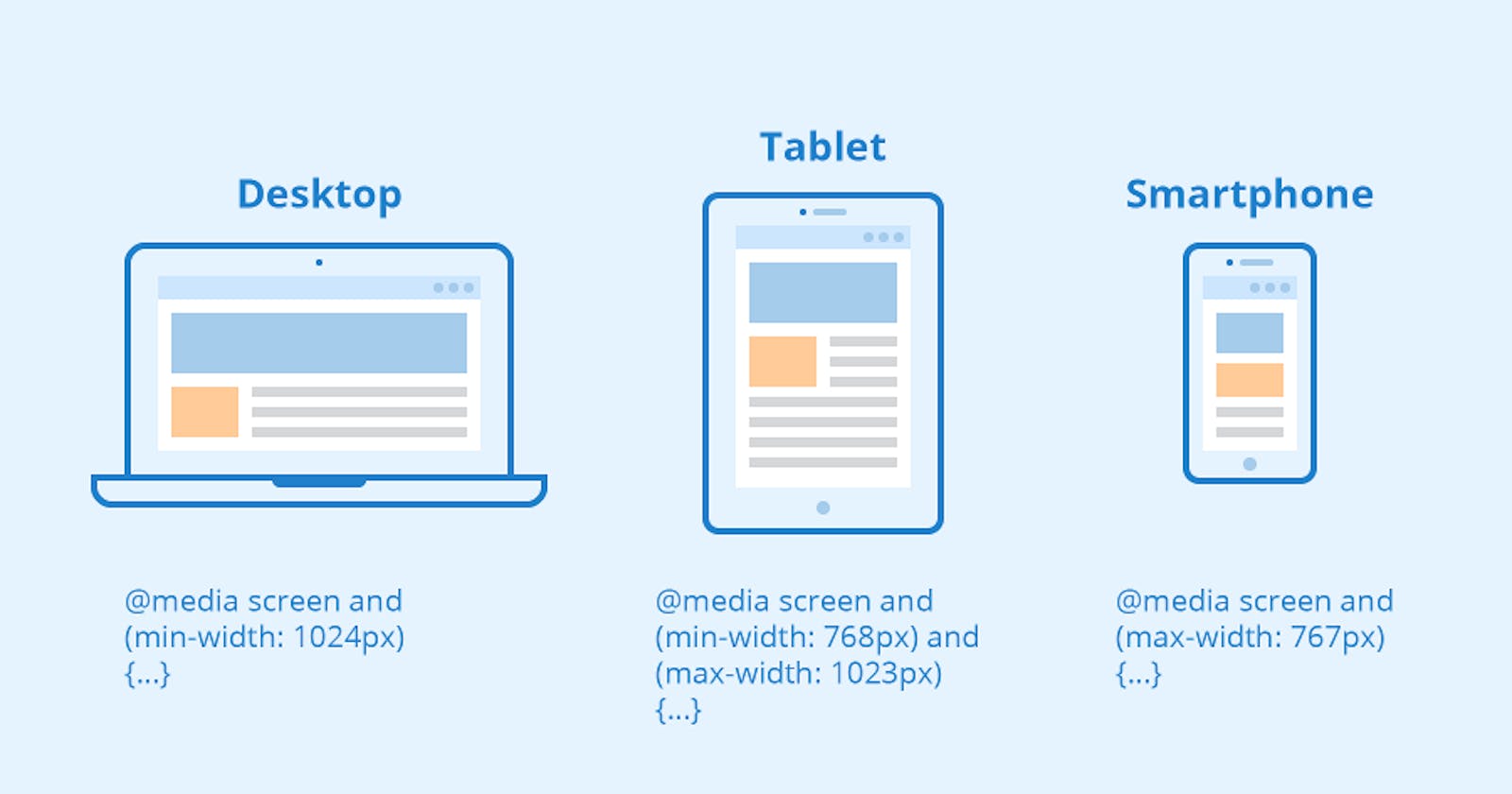
A media query is a CSS feature that allows a webpage to use different styles based on the properties of a device, such as screen size, orientation, and resolution. This can be useful for creating a responsive design that adjusts to different devices and screen sizes.
Here is the syntax for a media query:
@media (query) {
  /* CSS rules go here */
}
The query is placed inside parentheses and consists of a media type (such as
screen,speech) and one or more media features (such asmin-width,max-width,orientation, andresolution).Here is an example of a media query that changes the font size of an element when the screen width is less than 500 pixels:
@media (max-width: 500px) {
  body {
    font-size: 12px;
  }
}
You can also use multiple queries and combine them with logical operators, such as
andandnot. For example:@media (max-width: 500px) and (orientation: portrait) { /* CSS rules go here */ } @media (min-width: 500px) and (max-width: 800px) { /* CSS rules go here */ } @media not all and (monochrome) { /* CSS rules go here */ }Media queries can be used in the
<style>element of an HTML document, or in an external stylesheet. They can also be used in JavaScript using thewindow.matchMedia()function.
Portrait and Horizontal Orientation:
Media queries can be used to apply styles based on a variety of conditions, such as the width and height of the viewport, the orientation of the device
(portrait or landscape), and the resolution of the display.Here is an example of a media query that changes the layout of a webpage based on the orientation of the device:
@media (orientation: portrait) {
  /* styles for portrait orientation go here */
}

@media (orientation: landscape) {
  /* styles for landscape orientation go here */
}
In this example, the first media query will apply the specified styles if the device is in portrait orientation, and the second media query will apply the styles if the device is in landscape orientation.
Media queries can also be combined to create more complex rules. For example:
@media (min-width: 700px) and (max-width: 999px) {
  /* styles for viewports between 700px and 999px go here */
}
This media query will apply the specified styles if the width of the viewport is between 700 pixels and 999 pixels.