

CSS Positions, Box Model and CSS Grid
Understanding in detail CSS Positioning, Box Model, and CSS Grid terminologies.


CSS Positions:
In CSS, the position property is used to specify the type of positioning method used for an element. There are five possible values for the position property:
static: This is the default value. Elements with a static position are not affected by the top, bottom, left, or right properties.
relative: Elements with a relative position are positioned relative to their normal position. If you specify a top, bottom, left, or right value, the element will be shifted from its normal position in the direction you specify.
/* This element will be shifted 10 pixels to the right and 5 pixels down
from its normal position */
element {
  position: relative;
  top: 5px;
  right: 10px;
}
absolute: Elements with an absolute position are positioned relative to their nearest ancestor with a non-static position. If there is no such ancestor, the element is positioned relative to the initial containing block.
/* This element will be positioned 10 pixels from the top and 20 pixels
from the left of its nearest ancestor with a non-static position */
element {
  position: absolute;
  top: 10px;
  left: 20px;
}
fixed: Elements with a fixed position are positioned relative to the initial containing block, and they will remain in the same position even if the page is scrolled.
/* This element will be positioned 10 pixels from the top and 20 pixels
from the left of the initial containing block, and it will remain in this
position even if the page is scrolled */
element {
  position: fixed;
  top: 10px;
  left: 20px;
}
sticky: Elements with a sticky position are positioned based on the normal flow of the document, but once the element's parent container is scrolled, the element will become fixed to the top, bottom, left, or right of its parent container, depending on the values of the top, bottom, left, and right properties.
/* This element will be positioned normally until the parent
 container is scrolled, at which point it will become fixed to
 the top of the parent container */
element {
  position: sticky;
  top: 0;
}
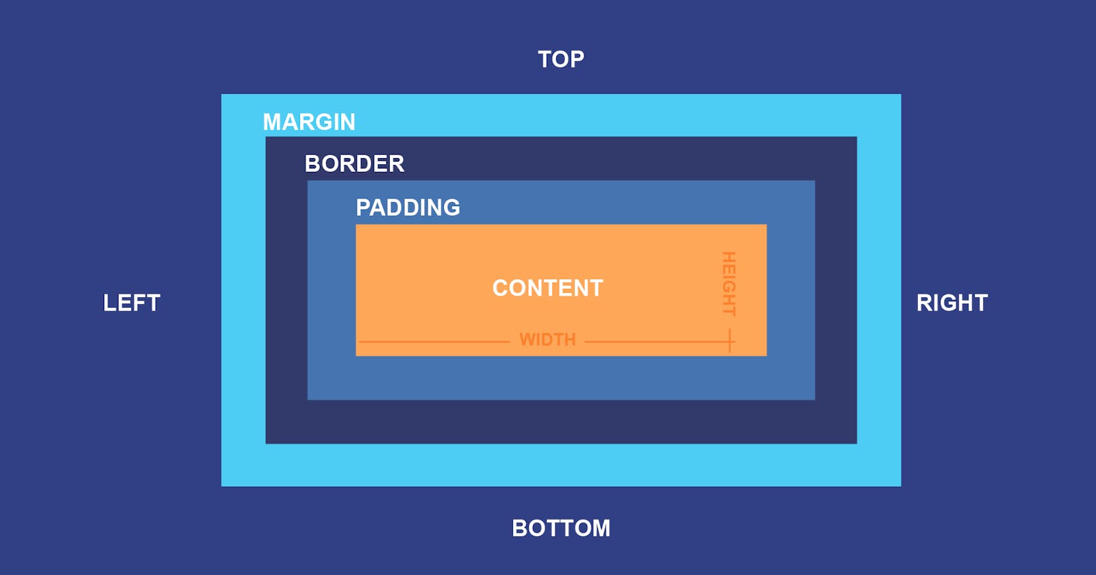
CSS Box Model:
The CSS box model describes the rectangular boxes that are generated for elements in the document tree and laid out according to the visual formatting model. Each box has a content area, and may also have padding, borders, and margins.
The figure below illustrates the different parts of the box model:
+--------------------------------------------------+
|                                                  |
|  +--------------------------------------------+  |
|  |                                            |  |
|  |  +----------------------------+            |  |
|  |  |                            |            |  |
|  |  |                            |            |  |
|  |  |                            |            |  |
|  |  |                            |            |  |
|  |  +----------------------------+            |  |
|  |                                            |  |
|  |                                            |  |
|  +--------------------------------------------+  |
|                                                  |
+--------------------------------------------------+
The content area is the area inside the padding, border, and margin of the element. This is where the element's content is displayed.
The padding is the space between the content and the border of the element. The padding is transparent, and it is used to create space between the content and the border.
The border is a thin line that surrounds the padding and content of the element. The border can have various styles, such as solid, dashed, or dotted.
The margin is the space outside the border of the element. The margin is transparent, and it is used to create space between the element and the other elements around it.
Here is an example of the CSS box model in action:
element {
  /* Set the width and height of the content area */
  width: 300px;
  height: 200px;

  /* Add some padding */
  padding: 10px;

  /* Add a solid border */
  border: 2px solid black;

  /* Add some margin */
  margin: 20px;
}
This code will create a box with a content area that is 300 pixels wide and 200 pixels high, with a 10-pixel padding on all sides, a 2-pixel solid black border on all sides, and a 20-pixel margin on all sides. The resulting box will be 342 pixels wide and 242 pixels high (300 + 210 + 22 + 2*20).
Box Model (Padding, Margin, Border):
In the CSS box model, the padding, margin, and border properties are used to add space and lines around elements.
Padding
The padding is the space between the content and the border of the element. The padding is transparent, and it is used to create space between the content and the border.
/* Add 10 pixels of padding to all sides of the element */
element {
  padding: 10px;
}

/* Add 10 pixels of padding to the top and bottom, and
20 pixels of padding to the left and right */
element {
  padding: 10px 20px;
}

/* Add 10 pixels of padding to the top, 20 pixels of
padding to the right and left, and 30 pixels of padding to the bottom */
element {
  padding: 10px 20px 30px;
}

/* Add 10 pixels of padding to the top, 20 pixels of
padding to the right, 30 pixels of padding to the bottom,
and 40 pixels of padding to the left */
element {
  padding: 10px 20px 30px 40px;
}
Margin
The margin is the space outside the border of the element. The margin is transparent, and it is used to create space between the element and the other elements around it.
/* Add 10 pixels of margin to all sides of the element */
element {
  margin: 10px;
}

/* Add 10 pixels of margin to the top and bottom, and 20 pixels
of margin to the left and right */
element {
  margin: 10px 20px;
}

/* Add 10 pixels of margin to the top, 20 pixels of margin to the
right and left, and 30 pixels of margin to the bottom */
element {
  margin: 10px 20px 30px;
}

/* Add 10 pixels of margin to the top, 20 pixels of margin to the
right, 30 pixels of margin to the bottom, and 40 pixels of margin
to the left */
element {
  margin: 10px 20px 30px 40px;
}
Border
The border is a thin line that surrounds the padding and content of the element. The border can have various styles, such as solid, dashed, or dotted.
/* Add a solid black border to all sides of the element */
element {
  border: 2px solid black;
}

/* Add a solid red border to the top and bottom, and a dashed blue
 border to the left and right */
element {
  border-top: 2px solid red;
  border-bottom: 2px solid red;
  border-left: 2px dashed blue;
  border-right: 2px dashed blue;
}

/* Add a solid green border to the top, a dotted purple border to the
 right, a dashed orange border to the bottom, and a solid pink border
to the left */
element {
  border-top: 2px solid green;
  border-right: 2px dotted purple;
  border-bottom: 2px dashed orange;
  border-left: 2px solid pink;
}
You can also use the border property to set the border style, width, and color in a single shorthand declaration:
/* Add a 2-pixel wide solid red border to all sides of the element */
element {
  border: 2px solid red;
}
CSS Grid:
CSS Grid is a layout system for the web that allows you to create a grid of rows and columns to lay out your content. It is designed to make it easy to create complex, responsive layouts with a minimum of code.
Here is an example of a simple CSS Grid layout:
/* Create a grid container with a display of grid */
.grid-container {
  display: grid;
}

/* Define the number of columns and rows in the grid */
.grid-container {
  grid-template-columns: 200px 200px 200px;
  grid-template-rows: 100px 100px 100px;
}

/* Place grid items into the grid */
.grid-item {
  grid-column: 1 / 2;
  grid-row: 1 / 3;
}
This code will create a grid with three columns and three rows, and it will place the .grid-item element in the top-left cell of the grid, spanning two columns and two rows.
You can also use the grid-template-areas property to define the layout of the grid using named grid areas:
/* Create a grid container with a display of grid */
.grid-container {
  display: grid;
}

/* Define the grid layout using named grid areas */
.grid-container {
  grid-template-columns: 200px 200px 200px;
  grid-template-rows: 100px 100px 100px;
  grid-template-areas:
    "header header header"
    "sidebar main main"
    "footer footer footer";
}

/* Place grid items into the grid using the named grid areas */
header {
  grid-area: header;
}

sidebar {
  grid-area: sidebar;
}

main {
  grid-area: main;
}

footer {
  grid-area: footer;
}
This code will create the same grid as before, but the layout is defined using named grid areas instead of grid lines.
There are many other properties and techniques for creating more complex grid layouts, such as using the grid-gap property to add space between the grid cells, using the grid-auto-flow property to control how the grid items are placed into the grid, and using the grid-template shorthand property to set multiple grid properties in a single declaration.