CSS Units
Color = text-color
Background-color = background color of the tag, class or ID.
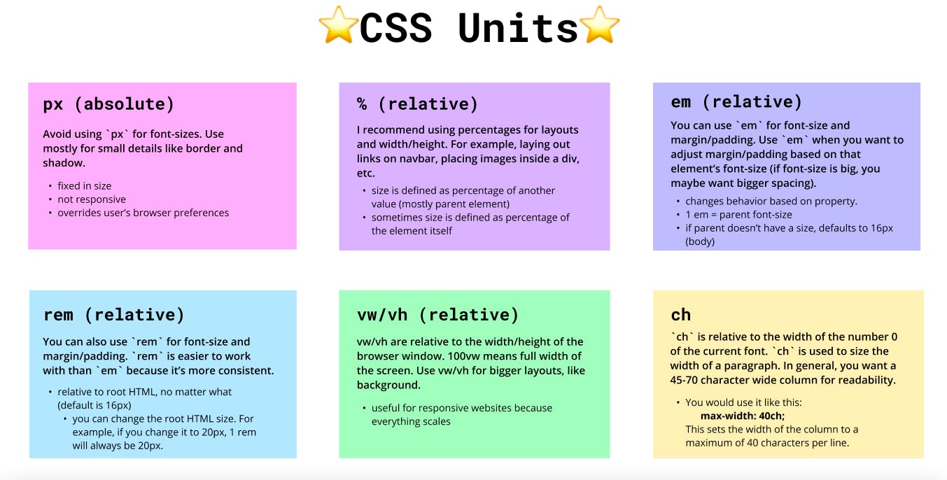
Units = px, %, vw, vh, em, rem
PX: Pixels (px) are considered absolute units, although they are relative to the DPI and resolution of the viewing device
EM: Relative to the parent element
REM: Relative to the root element (HTML tag)
%: Relative to the parent element
VW: Relative to the viewport’s width (takes values from the screen)
VH: Relative to the viewport’s height (takes values from the screen)
The number you specify will multiply that number times the default size.
In CSS, vmin and vmax are viewport units that represent the minimum and maximum dimensions of a viewport. vmin is the smaller of the viewport's height or width, while vmax is the larger of the two.
vmin and vmax can change when the browser window is resized or the orientation of a mobile device changes. For example, if a phone is 300 pixels wide and 800 pixels tall, vmin would represent the width of the viewport and vmax would represent the height.
vmin and vmax can be used as relative units:
vh: Assigns 1% of the viewport height to the element.
vw: Assigns 1% of the viewport width to the element.
vmax: Assigns 1% of the larger unit of vh or vw to the element.
vmin: Assigns 1% of the smaller unit of vh or vw to the element.
1em = 16px (1 * 16)
2em = 32px (2 * 16)
.5em = 8px (.5 * 16)
1rem = 16px
2rem = 32px
.5rem = 8px
100% = 16px
200% = 32px
50% = 8px
All CSS Dimension Properties
| Property | Description | | --- | --- | | max-height | Sets the maximum height of an element | | max-width | Sets the maximum width of an element | | min-height | Sets the minimum height of an element | | min-width | Sets the minimum width of an element |
Line height:
The CSS line-height property sets the height of a line box and the distance between lines of text. It also defines the amount of space above and below inline elements.
Here are some other things the line-height property does:
Alters the width of a text line
Adjusts the font size of the text
Specifies the minimum height of line boxes within the element
Specifies the height that is used to calculate line box height
The syntax for the line-height property is:
line-height: normal|number|length|percentage|initial|inherit;.
Negative values are not allowed.
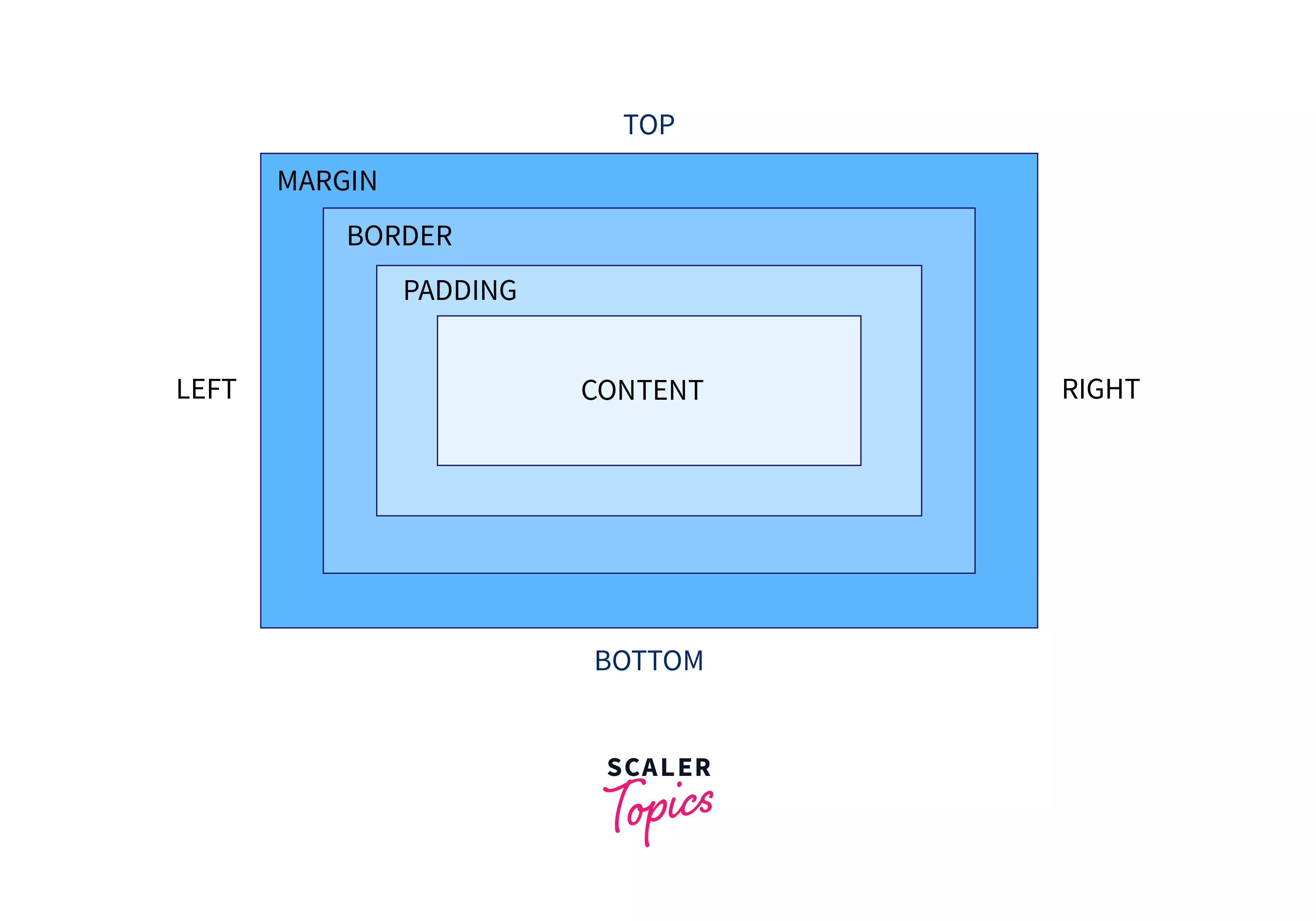
Padding vs Margin: In CSS, padding is the space between an element's content and its border, while margin is the space between the element's border and the next element.
In CSS, the display property has three options: block, inline, and inline-block.
Here are the differences between these options:
Block
Creates a block-level element that takes up the full width of its container. Block-level elements break up the flow of a document and always stack on top of each other.
Inline
Creates an inline-level element that allows side-by-side elements. Inline elements do not break up the flow of a document.
Inline-block
Takes the benefits of both block and inline-level elements. Inline-block elements respect top and bottom margins and paddings and can have elements before or after them. However, they do not add a line break after the element, so they can sit next to other elements.

Position In CSS:
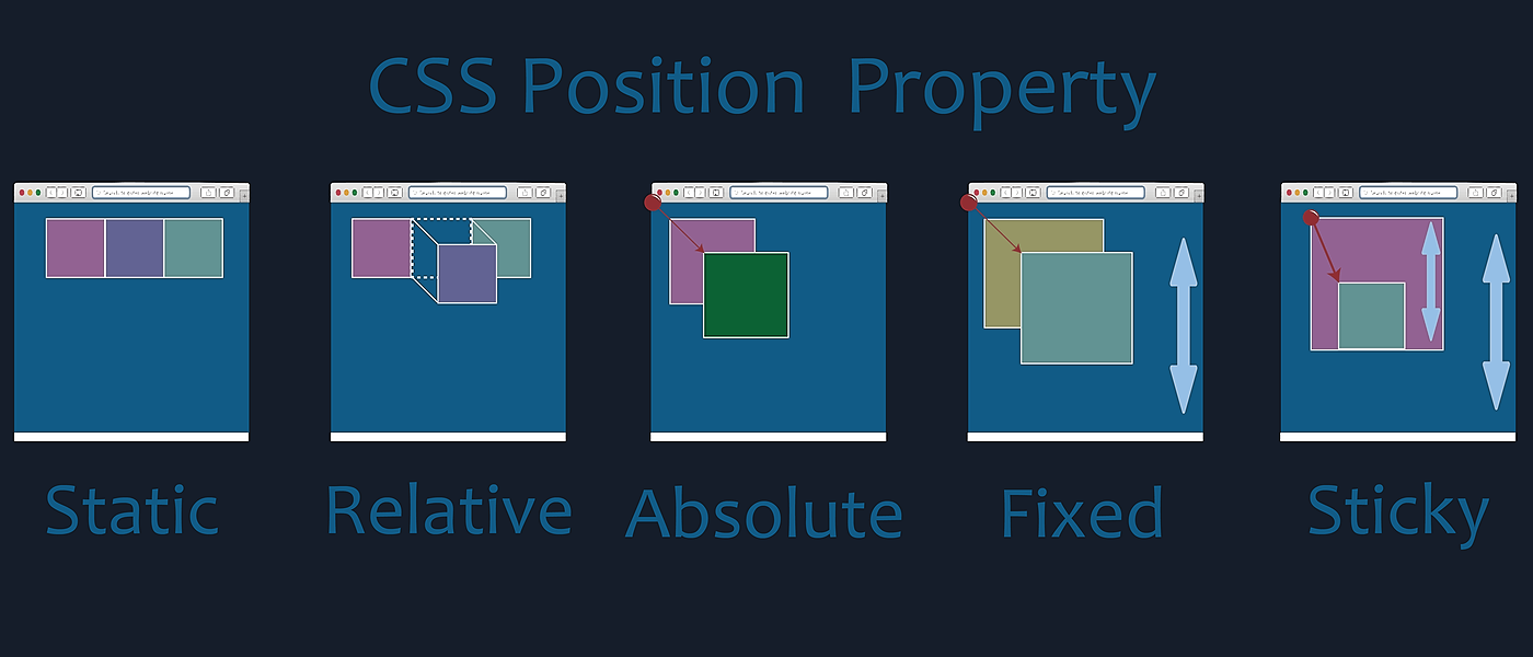
Static:
Default value.
Elements are positioned according to the normal flow of the document.
The
top,right,bottom, andleftproperties have no effect whenpositionis set tostatic.
    .example {
      position: static;
    }
Relative:
Positioned relative to its normal position in the document flow.
The
top,right,bottom, andleftproperties can be used to adjust its position relative to itself.
    .example {
      position: relative;
      top: 10px;
      left: 20px;
    }
Absolute:
Positioned relative to the nearest positioned ancestor (instead of positioned relative to the viewport, like fixed).
If there is no positioned ancestor, it uses the document body.
Does not leave a gap in the layout where it would have been.
    .example {
      position: absolute;
      top: 30px;
      right: 10px;
    }
Fixed:
Positioned relative to the viewport (browser window).
It does not move when the page is scrolled.
Does not leave a gap in the layout.
    .example {
      position: fixed;
      bottom: 0;
      right: 0;
    }
Sticky:
Positioned based on the user's scroll position.
It is treated as
relativepositioned until it crosses a specified point during scrolling.After that point, it is treated as
fixed-positioned.
    .example {
      position: sticky;
      top: 50px;
    }
It's important to note that when using absolute, fixed, or sticky, you should be aware of the containing context. The positioning is relative to the nearest positioned ancestor. If there is no positioned ancestor, it will be relative to the initial containing block, which is usually the viewport for fixed and the nearest block-level ancestor for absolute and sticky.
Media Query
/* Extra small devices (phones, 600px and down) */@media only screen and (max-width: 600px) {...}
/* Small devices (portrait tablets and large phones, 600px and up) */@media only screen and (min-width: 600px) {...}
/* Medium devices (landscape tablets, 768px and up) */@media only screen and (min-width: 768px) {...}
/* Large devices (laptops/desktops, 992px and up) */@media only screen and (min-width: 992px) {...}
/* Extra large devices (large laptops and desktops, 1200px and up) */@media only screen and (min-width: 1200px) {...}
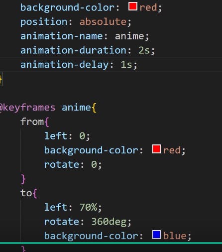
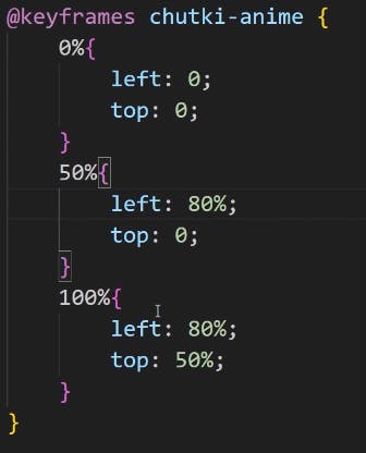
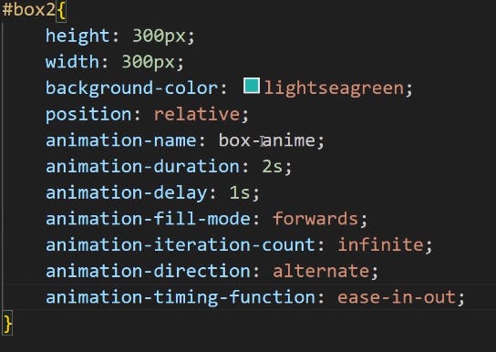
CSS Animations:
Transition Properties:

Animation:


Prefixes

:
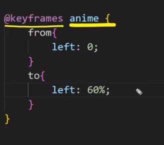
/* The animation code */
@keyframes example {
  from {background-color: red;}
  to {background-color: yellow;}
}

/* The element to apply the animation to */
div {
  width: 100px;
  height: 100px;
  background-color: red;
  animation-name: example;
  animation-duration: 4s;
}